Passive Solar Basement Efficiency
The graphs below summarize the results for the 2020-2021
heating season.
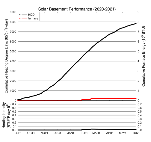
Click on the graph for a larger version.
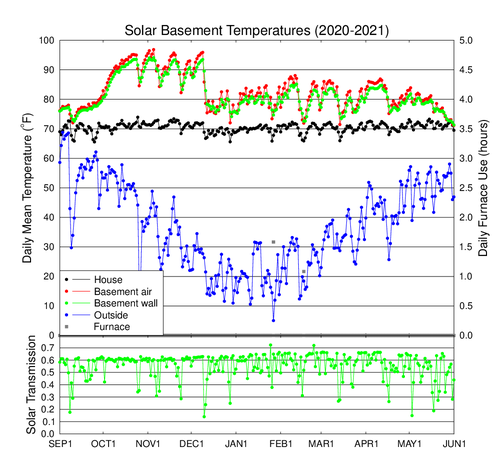
The graph above shows the observed daily average temperatures for the
2020-2021 heating season. The grey squares (along with the y axis on
the right edge of the plot) show how many hours per day the backup
propane furnace ran. The lower graph shows the ratio of daily average
surface solar flux to the top of atmosphere solar flux. The surface
solar flux on a horizontal plane is measured by the weather station, and
the top of atmosphere solar flux is calculated for the date and
location. Sunny days have a solar transmission above 0.6, and cloudy days
have lower values.
The winter was not very cold. We ran the furnace on only two days, but we
did let the house temperature stay below 64o on a few mornings.
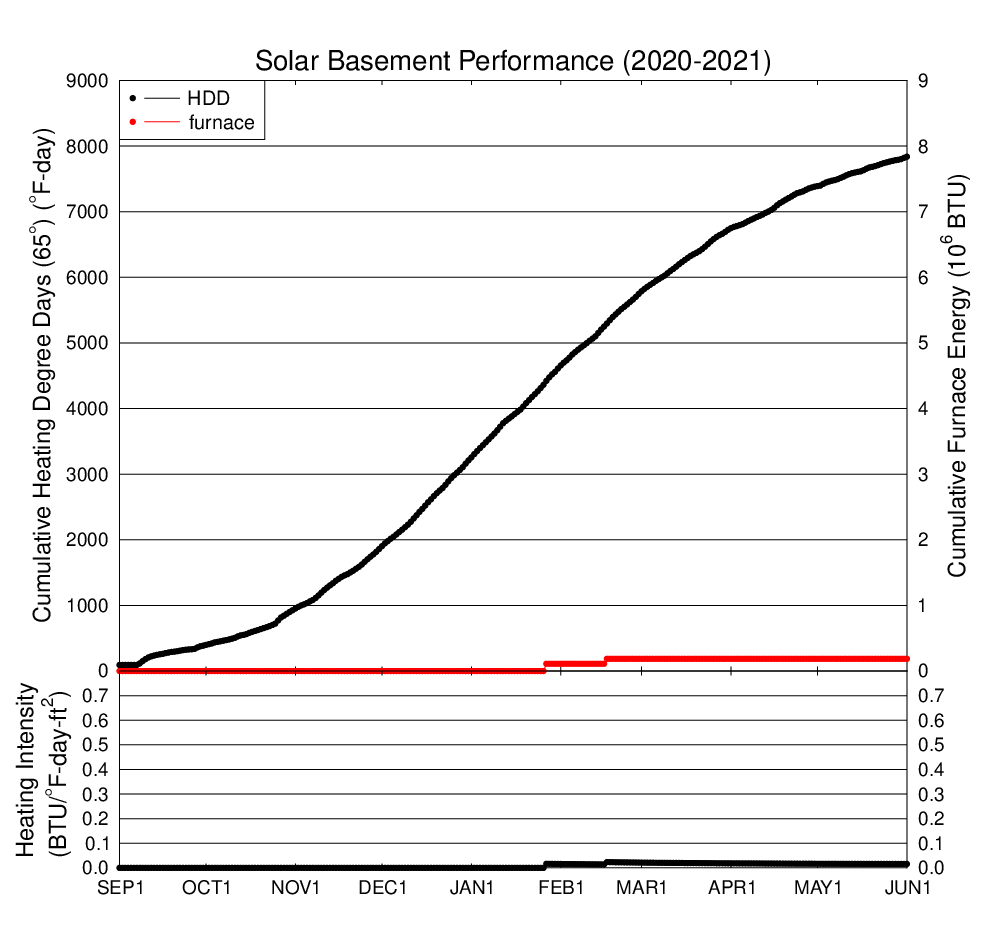
Click on the graph for a larger version.
The above graph shows the total heating degree days (HDD) accumulated
through the season and total BTUs provided by the propane furnace in our
house. These HDD are defined relative to the standard 65oF.
The furnace BTUs are calculated using the 70,000 BTU/hour furnace rating
and the time the furnace is on as measured by the computer.
This season the furnace was used for less than 3 hours. The ratio of BTUs to
heating degree days divided by the floor area of the house (1508 square
feet) is plotted in the lower panel. This ratio is called the heating
intensity index, and is a measure of how efficient the house is.
|